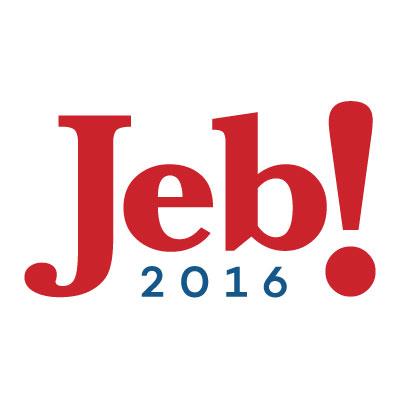
Looks like the Jeb! show has been running for years.

The Florida governor unveiled his 2016 campaign logo on Sunday, a day before he plans to officially enter the presidential contest with a speech in Miami. It’s relatively simple design, featuring only Bush’s first name in large, red lettering followed by an exclamation point, with the year 2016 in smaller type underneath.
It’s Bush’s first presidential bid — but it’s not the first time he’s used that design. It was his logo during all three of his political races.

Image courtesy screenshot
The Jeb! logo got its start in 1994, during Bush’s first bid for governor, with white wording on a red background. Even though Bush lost that first gubernatorial bid, he retained the same logo for his successful race in 1998. And then used it again in his 2002 re-election bid.
The only difference now is that the coloring is flipped, now featuring red words on a white background. The exclamation mark remains — and it prompted some snark on Twitter on Sunday.
It’s the musical event of the summer: https://t.co/druMLroOai
— andrew kaczynski? (@KFILE) June 14, 2015
“It’s the musical event of the summer,” tweeted @BuzzFeedAndrew, insinuating that it makes Jeb! look like a Broadway show instead of a serious politician.
Jeb Bush, the Yahoo! of GOP candidates http://t.co/ALEV7N7nGF pic.twitter.com/L06WA6UHBL
— MCWM is at MWC (@mcwm) June 14, 2015
“Jeb Bush, the Yahoo! of GOP candidates,” wrote @mcwm.
Others speculated that the exclamation mark gives Bush an out from using his last name and reminding people that he comes from political royalty.
When I say Jeb! Bush I will now always use the exclamation—which shall forever be part of Jeb! Bush’s name. @JebBush http://t.co/UF9lmon3GN
— Ben Norton (@BenjaminNorton) June 14, 2015
“The punctuation is there to remind you to never utter his last name,” tweeted @BenjaminNorton.
Still others noted the logo’s similarity to a design used by Sen. Lamar Alexander, R-Tenn., in his 1996 presidential campaign.
Jeb Bush just unveiled his campaign’s logo. “Bush” is absent — and it reminds me of Lamar! ’96 pic.twitter.com/A4usTCC8cB
— Robert Costa (@costareports) June 14, 2015
“Jeb Bush just unveiled his campaign’s logo. ‘Bush’ is absent — and it reminds me of Lamar! ’96,” tweeted @costareports.
